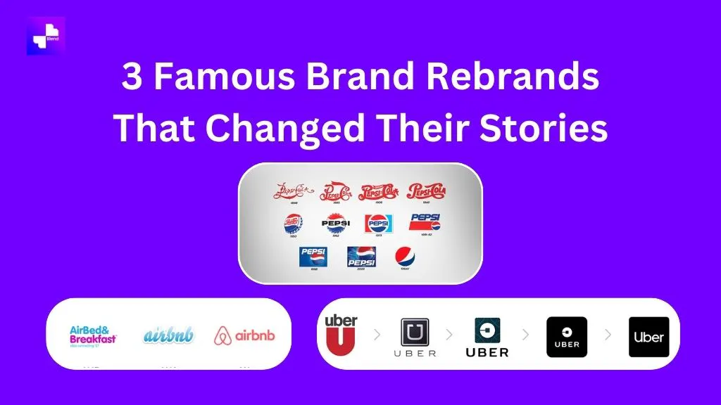
Branding is more than just a logo; it’s a company’s identity. A well-executed rebranding effort can redefine perception, connect with new audiences, and position companies for long-term success. When iconic brands like Airbnb, Uber, and Pepsi decided to rebrand, their journeys weren’t just creative exercises — they were business transformations. Let’s dive into how these companies used rebranding to make waves, and how tools like Blendnow, an AI logo generator, are making such transformations accessible to everyone.
Case Study: Airbnb's Rebranding Journey
Airbnb's 2014 rebranding is a textbook example of how a visual overhaul can powerfully align with a company's mission.
The Old vs. New Logo
Airbnb's previous logo was a plain, uninspiring wordmark that lacked emotional depth. In 2014, they introduced the “Bélo”, a symbol meant to represent community, belonging, and universal inclusivity. The new logo blended simplicity with versatility, making it instantly recognizable and adaptable for digital and physical touchpoints alike. To learn about the process, DesignStudio, the brains behind this rebrand, breaks it down on their Airbnb project page.

Impact on Brand Identity
The Bélo wasn’t just a shape; it was an embodiment of Airbnb’s promise to make the world feel like home. It tied together values of people, love, and connection. This simple design became a beacon for a global, inclusive community.
Reception and Results
Airbnb saw a surge in brand loyalty post-rebranding. Initially, there was skepticism, as some thought the design resembled unrelated symbols. However, the logo quickly gained acceptance as a cornerstone of the company’s identity. According to this comprehensive case study, Airbnb’s valuation doubled within a couple of years after the rebrand.
Case Study: Uber's Logo Evolution
When Uber debuted, it wasn’t without controversy — and this extended to its branding. In 2016 and 2018, it revamped its logo to better align with its evolving narrative.

Initial Logo and Its Critiques
Uber’s early logo utilized a stark “U” letterform, which communicated efficiency but came across as cold and distant. Critics found it impersonal, a reflection of some of the cultural critiques the company faced.
New Logo and Brand Message
In 2018, Uber made its next big change with a simple, sans-serif logo in black and white. This clean design aimed to portray trust and sophistication, signaling the company’s pivot toward safety and responsibility. The design process behind the transformation is highlighted by Victor Fatanmi.
Influence on Market Positioning
Uber's rebranding signaled their shift to a service-first approach built on reliability. By focusing on delivering quality experiences, the rebrand helped repair its tarnished public image and strengthened its positioning as a leader in the ride-share space.
Case Study: Pepsi and Its Logo Revamps
Over the decades, Pepsi has gone through numerous iterations of its iconic logo. Each refresh reflected both cultural shifts and the company’s market ambitions.

The Iconic Globe Evolution
Pepsi’s famous red, white, and blue globe motif wasn’t always its hallmark. Starting as a wordmark in 1898, the logo transformed into a bottle cap symbol in the mid-20th century. Over time, it evolved into a more abstract globe, symbolizing a youthful, energetic vibe. You can track the timeline of these changes in this Pepsi logo breakdown.
Cultural Relevance and Marketing Campaigns
Pepsi’s rebrands were deeply intertwined with their marketing strategies. Whether it was aligning with the pop culture of the ‘80s or embracing minimalism for modern times, Pepsi understood the cultural pulse.
Economic Impact of Rebranding
Every new logo refresh not only sustained Pepsi’s relevance but also bolstered its market share. Its commitment to reinvention has made it one of the most recognizable brands globally, as explored in this logo history article.
Introducing Blendnow: Your AI Logo Generator
While the above brands had massive budgets and renowned design firms, not every business needs to break the bank to achieve great branding. That’s where Blendnow comes in.
How Blendnow Works
Blendnow uses advanced AI to simplify logo design. With an intuitive interface, users can create logos tailored to their vision in moments. No prior design skills are needed — it’s as easy as typing in your brand name, choosing a style, and letting the AI generate options.
Benefits of Using Blendnow for Rebranding
- Affordable and Fast: Skip the design agency fees and long timelines.
- Customization: Blendnow offers endless variations to suit your brand identity.
- Consistency: Generate designs that look professional across all touchpoints, from social media to print.
Real-Life Success Stories with Blendnow
Several small businesses have unlocked their potential through Blendnow. From startups establishing their first logos to mid-sized companies refreshing outdated designs, the tool simplifies rebranding without sacrificing quality.
Conclusion
Rebranding is an artful blend of creativity, strategy, and timing. Whether it’s Airbnb fostering global belonging, Uber rebuilding trust, or Pepsi staying fresh and relevant, the stories above show what’s possible with thoughtful design. And thanks to tools like Blendnow, businesses of all sizes can take the leap toward creating a lasting impression — without the hefty price tag. If you're ready to explore your brand's next chapter, now is the time to make it happen.
